Creating GUI controls.
Most of G4P's controls have a visual user-interface which occupies a rectangular position on the display. The position and size of the rectangle must be specified when creating the control with its constructor. G4P gives you 3 different ways of specifying the rectange, for instance this button ...
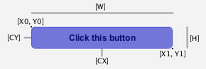
| Mode | Location & size specifiers |
|---|---|
| GCtrlMode.CORNER | X0, Y0, W, H |
| GCtrlMode.CORNERS | X0, Y0, X1, Y1 |
| GCtrlMode.CENTER | CX, CY, W, H |
The default mode is CORNER and unless there is some great need I would use that mode exclusively.
If you must change the mode then use control.setCtrlMode(mode) for instance the following code
G4P.setCtrlMode(GControlMode.CENTER);
btn = new GButton(this, 100, 90, 96, 32, "A button");
will create a button 96 pixels wide, 32 pixels high centred about the position[X = 100, Y = 90].
When you use setCtrlMode(mode) then this mode will remain in effect until it is changed
again.
Double Buffering
All G4P visual controls use double buffering which means they are rendered to an offscreen buffer and the buffer copied to the display every frame. When the state of the control changes e.g. mouse clicks on a button, slider thumb dragged etc. then the buffer is redrawn. This results in a slight increase in memory usage but significantly reduces the CPU load on maintaining the controls visual appearance.
For most controls like GButton its size is constrained by the buffer size but this is not the case for sliders. If you create a slider and it looks like it has been cropped, simply increase the buffer size.
Summary
To create a GUI control you must use the appropriate constructor. All constructors are similar in that they have 5 of more parameters but the first five have the same meaning whatever the control.
|
Parameter Number
|
Data Type
|
Value
|
|---|---|---|
|
1
|
PApplet | This parameter defines the sketch window to display the control. If the control is too
appear in the main sketch display the it has the value this (Java keyword) |
|
2
|
float | These four parameters specify the location and size of the control on the
display. The meaning and order of each parameter is shown in the table above. |
|
3
|
float | |
|
4
|
float | |
|
5
|
float | |
|
6+
|
various | You might be required to provide additional information. For instance in the button
example code above this is a String value for the text to appear on the button face. Look at the reference pages for the control you want to create for what you can put here. |