Creating a Custom Slider
Introduction
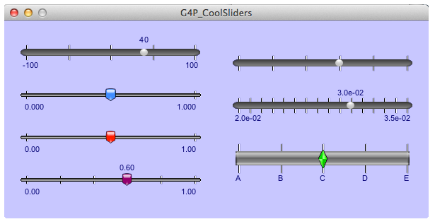
G4P comes with 5 custom sliders for your immediate use. You can see them if you run the G4P_CoolSliders example that comes with the library.
Historical Note
The original custom slider was the GWSlider class created in 2009 by Daniel Brown a student of Professor Andreas Freise, the creator of the gwoptics library for Processing. When Processing changed to version 2 the GWSlider class, like the rest of G4P, had to be refactored and the new class was renamed GCustomSlider. The only original parts remaining are the graphic images used to make these sliders.
Creating our own slider 'skin'
A skin requires 5 image files for different parts of the slider.
The image files have specific names.
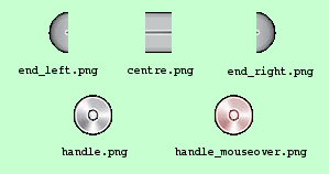
- Left end (end_left.???)
- Right end cap (end_right.???)
- Track segment(centre.???)
- Tthumb : mouse off (handle.???)
- Thumb : mouse over (handle_mouseover.???)
Where ??? is the image type file extension. The image type can be any that Processing can handle, the most common types will be png, jpg or gif but tga is also permitted.
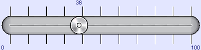
Using these images we can create a slider that will look like this -
Creating the sketch
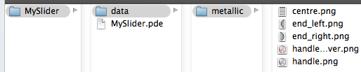
The five images must be stored in their own folder and the name of the folder will be the skin name. Any sketch that wants to use this skin must have the skin folder located either inside the sketch folder or the sketch's data folder (preferred location).
I have decided that this skin will be called 'metallic' and this shows the file structure of the sketch using it.
Here is the sketch code (MySlider.pde) used to create the slider shown above :
import g4p_controls.*;

GCustomSlider slider;

void setup() {
  size(500, 200);
  slider = new GCustomSlider(this, 50, 50, 400, 100, "metallic");
  slider.setShowValue(true);
  slider.setShowLimits(true);
  slider.setLimits(38, 0, 100);
  slider.setNbrTicks(11);
  slider.setShowTicks(true);
  slider.setEasing(6.0);
  slider.setNumberFormat(G4P.INTEGER, 0);
  slider.setOpaque(true);
}

void draw() {
  background(200, 200, 220);
}
Things you should know
There are very few restrictions about the images you use but when designing the images you should consider the following facts:
- the slider will be created to fit the control size (specified in the constructor)
- the horizontal space allocated for the end-caps will be the same for each end (uses the width or the larger end cap image)
- the track width will be the height of the centre image
- the centre image will be tiled along the track length
- the track will be placed in the horizontal and vertical centre of the control.
- the end cap images will be placed in the vertical centre of the control and butted against the track.